
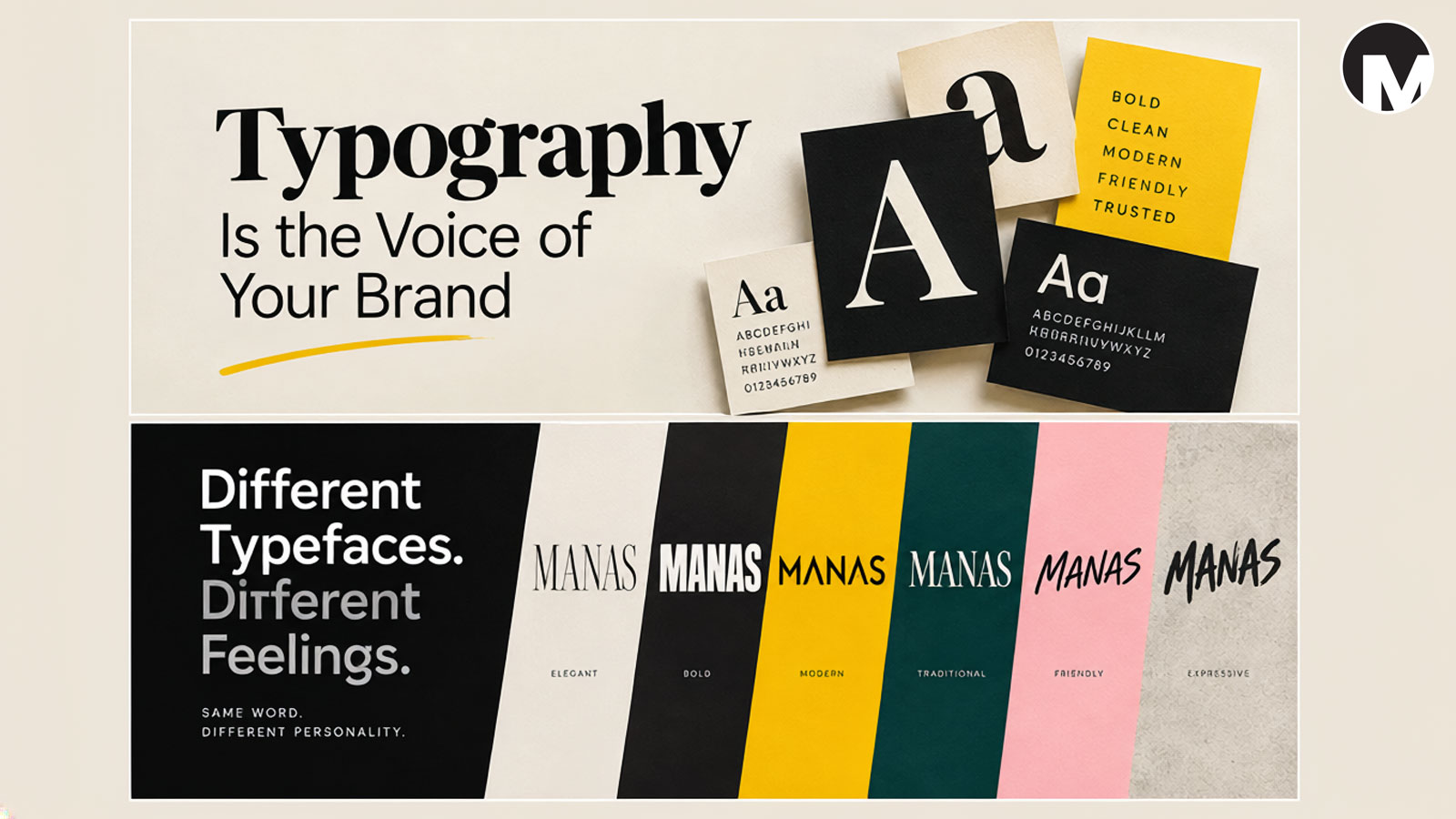
When we look at a brand, we don’t only notice its logo or colors.
We also notice the words.
And before we even read what those words say, we can already get a feeling from the way they look.
A bold typeface can feel confident and powerful.
A thin, elegant typeface can feel sophisticated.
A playful rounded font can feel friendly and youthful.
A sharp geometric typeface can feel modern and precise.
That is what makes typography so interesting.
Typography is not simply about choosing a font that looks nice. It is about giving written language a visual personality.
As a graphic designer, I think of typography as the voice of a brand.
The words may be saying one thing, but the typography helps determine how those words sound visually.
At Manas Graphics, typography is an important part of creating a visual identity because the right typeface can completely change the personality of a brand.
1. What Is Typography?
Typography is the art and practice of arranging text so that it is readable, clear, and visually meaningful.
It includes much more than simply choosing a font.
Typography involves:
- Typeface selection
- Font weight
- Size
- Spacing
- Alignment
- Line height
- Letter spacing
- Hierarchy
- Composition
- Relationship between text and other visual elements
All of these decisions affect how people experience a design.
Think about the same sentence written in five completely different typefaces.
The words haven’t changed.
But the personality has.
That is the power of typography.
2. Typography Has a Personality
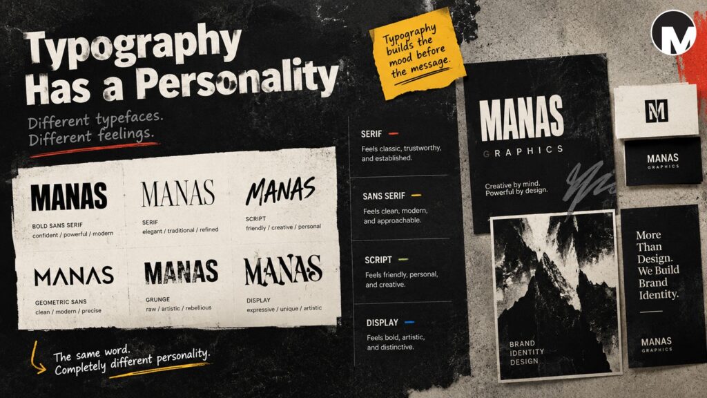
Every typeface has a visual character.
Some typefaces feel serious.
Some feel friendly.
Some feel traditional.
Some feel experimental.
Some feel technical.
Some feel luxurious.
Some feel raw and expressive.
This is why typography should be selected according to the personality of the brand.
Imagine a children’s creative brand using a very rigid corporate typeface.
It might communicate professionalism, but perhaps not the playful personality the business needs.
Now imagine a serious financial company using an extremely decorative display typeface.
The design might look interesting, but the visual personality could communicate something completely different from the intended message.
The typeface needs to make sense for the brand.
3. Serif and Sans Serif
Two of the most familiar categories in typography are serif and sans serif.
Serif
Serif typefaces have small finishing strokes at the ends of letters.
They can create feelings of tradition, authority, elegance, editorial character, or heritage.
This is one reason serif typography is often seen in publishing, luxury brands, cultural institutions, and businesses that want to communicate a more established personality.
Sans Serif
Sans serif typefaces do not have those finishing strokes.
They often feel clean, modern, direct, and contemporary.
Many modern brands use sans serif typography because it can work well across websites, digital interfaces, packaging, signage, and logos.
But I don’t think of serif as “old” and sans serif as “modern.”
That is too simple.
There are traditional-looking sans serifs and highly contemporary serifs.
The actual personality depends on the specific typeface and how it is used.
4. Bold Typography Can Create Confidence
Weight is another important part of typography.
A bold typeface immediately creates stronger visual presence.
It can feel confident, powerful, energetic, or direct.
This can work particularly well for brands that want a strong visual identity.
A lighter weight can create a very different feeling.
It may feel elegant, refined, minimal, or delicate.
The interesting part is that you don’t always need to change the typeface.
Sometimes simply changing its weight can change the entire visual impression.
This is why typography gives designers so many possibilities.
5. Typography Can Create Hierarchy
Good typography doesn’t mean making every piece of text look equally important.
Imagine opening a website where the title, subtitle, paragraph, button, and small information text are all exactly the same size.
Everything would compete for your attention.
This is where typographic hierarchy becomes important.
A simple hierarchy might look like:
Main Heading
Large and visually dominant.
Subheading
Smaller and supporting the main idea.
Body Text
Comfortable to read and easy to follow.
Small Information
Used for secondary details.
Hierarchy helps the viewer understand where to look first, what to read next, and what information is less important.
Typography is therefore not only about beauty.
It is also about communication.
6. Spacing Can Change Everything
One of the things I enjoy about typography is that even small spacing changes can completely affect a design.
Letter spacing can make a word feel:
- Tight and powerful
- Open and elegant
- Compact and energetic
- Calm and sophisticated
Line spacing can also change readability.
When text is too tightly packed, it can feel uncomfortable.
When there is too much space, the relationship between lines can become disconnected.
Good typography often comes from finding the right balance.
Sometimes the difference between an ordinary typographic design and a strong one is not the font itself.
It is the spacing.
7. Typography in Logo Design
Typography becomes especially interesting when designing logos.
Some logos are built entirely from lettering.
Others combine a symbol with a wordmark.
In both cases, typography can become a major part of the identity.
A designer might:
- Choose an existing typeface
- Modify individual letters
- Adjust spacing
- Create custom letterforms
- Combine typography with a symbol
- Build an entirely custom wordmark
This is why a logo should not simply be created by typing a company name into a font and calling it finished.
Typography can become part of the concept itself.
A small modification to one letter can sometimes create something much more distinctive.
8. The Same Word Can Feel Completely Different
Here is a simple experiment.
Imagine the word:
MANAS
Now imagine it written in:
- A thin elegant typeface
- A heavy bold typeface
- A geometric sans serif
- A classic serif
- A handwritten script
- A rough experimental typeface
The word is exactly the same.
But the personality changes.
This is one of my favorite things about graphic design.
The designer isn’t changing the meaning of the word itself.
The designer is changing the visual experience of the word.
Typography gives language a visual voice.
9. Don’t Choose a Font Just Because It Looks Good
This is something I think about when working on branding.
Sometimes we see a typeface and immediately think:
“This looks cool.”
But that isn’t always enough.
A better question is:
“Does this typeface belong to this brand?”
Before choosing typography, I like to think about:
Who is the audience?
What does the business do?
What personality should the brand communicate?
Should it feel modern or traditional?
Should it feel serious or playful?
Should it feel minimal or expressive?
Should it feel professional, artistic, technical, friendly, or bold?
Typography should have a reason behind it.
Just like color, it should support the larger visual idea.
10. Typography and Brand Consistency
Typography becomes even more important when creating a complete brand identity.
A brand doesn’t communicate only through its logo.
Typography may appear on:
- Websites
- Social media
- Packaging
- Business cards
- Brochures
- Posters
- Presentations
- Advertisements
- Signage
- Documents
If typography changes randomly from one application to another, the brand can start to feel inconsistent.
A defined typographic system helps create recognition.
For example, a brand might have:
Primary Typeface
Used for major headings and important brand communication.
Secondary Typeface
Used for supporting information and body text.
Display Typeface
Used occasionally for special campaigns or expressive communication.
The exact system depends on the brand.
The important thing is consistency with flexibility.
11. Typography and Color Work Together
Typography doesn’t exist separately from the rest of the design.
It interacts with color, imagery, layout, shapes, and space.
Think about a large bold black headline on a white background.
Now imagine the same headline in bright yellow on a dark background.
The words haven’t changed.
But the visual energy has.
This is similar to what I discussed in my previous post about color.
Color creates one layer of communication, while typography creates another.
When both work together, the brand can develop a much stronger visual personality.
12. Don’t Follow Typography Trends Blindly
Typography trends can be exciting.
New typefaces appear all the time.
Certain styles become popular in branding, websites, posters, and social media.
Trends can be useful for inspiration.
But I don’t think a brand should choose typography simply because everyone else is using it.
A typeface can be fashionable today and feel ordinary tomorrow.
Instead, I prefer to ask:
Does this typography make sense for the brand?
A strong visual identity should have a reason behind its choices.
Trends can influence the exploration.
They shouldn’t replace the thinking.
13. Typography Should Work at Different Sizes
A brand typeface needs to survive different situations.
The same typography may appear as a huge website heading and later as very small text on packaging.
It might appear on a mobile screen, a business card, a poster, or a large sign.
This is why testing is important.
A typeface that looks beautiful in a large presentation may become difficult to read at a small size.
A display typeface may look fantastic in a logo but may not be suitable for long paragraphs.
Every typeface has strengths and limitations.
Understanding those limitations is part of good typography.
14. Typography Is Also About Restraint
Just because you have thousands of fonts available doesn’t mean you need to use them.
In many projects, using too many typefaces can make a design feel chaotic.
A simple typographic system can often be much stronger.
Sometimes one typeface with different weights is enough.
Sometimes two complementary typefaces can create a complete system.
The goal is not to show how many fonts a designer knows.
The goal is to communicate clearly.
Good typography often comes from knowing what to leave out.
15. How I Approach Typography at Manas Graphics
When I work on a visual identity, I don’t want typography to be an afterthought.
I like to understand the concept first.
Then I explore typefaces that could support that concept.
I look at different weights, proportions, spacing, letterforms, and combinations.
Sometimes a typeface looks perfect when viewed on its own but doesn’t work with the logo.
Sometimes an unexpected typeface combination creates something much more interesting.
This is where experimentation becomes important.
I test typography with the actual visual identity rather than judging it only inside a font menu.
Because design doesn’t happen inside a font menu.
It happens when typography meets the rest of the visual system.
Final Thoughts
Typography is much more than choosing a font.
It is about giving language a visual personality.
It can make a brand feel confident, elegant, friendly, modern, traditional, artistic, technical, or expressive.
But there is no single “perfect” typeface for every business.
The right choice depends on the brand, the audience, the message, and the overall visual direction.
For me, good typography is intentional.
It should communicate.
It should create hierarchy.
It should support the identity.
And it should feel like it belongs there.
A logo can introduce a brand.
Color can create a mood.
But typography gives the brand a voice.
And sometimes, before we even read what a brand is saying, we can already hear it through the way it looks.
More from Manas Graphics
In my next post, I’ll move from typography into one of the areas that inspires me deeply as a designer:
rock album covers — and what graphic designers can learn from them.