
Color is one of the first things we notice when we look at a design.
Before we read the words, understand the symbol, or study the details, color can already create a feeling.
A deep blue can feel calm and trustworthy. Red can feel energetic and powerful. Yellow can feel bright and optimistic. Black can feel sophisticated, bold, or serious.
But color is not simply about choosing a color that “looks good.”
In graphic design, color can influence how people experience a brand.
As a designer, I find color fascinating because it can communicate something without using a single word. It can change the mood of a logo, make a brand feel more energetic, or create a completely different personality.
At Manas Graphics, I see color as an important part of the visual language of a brand.
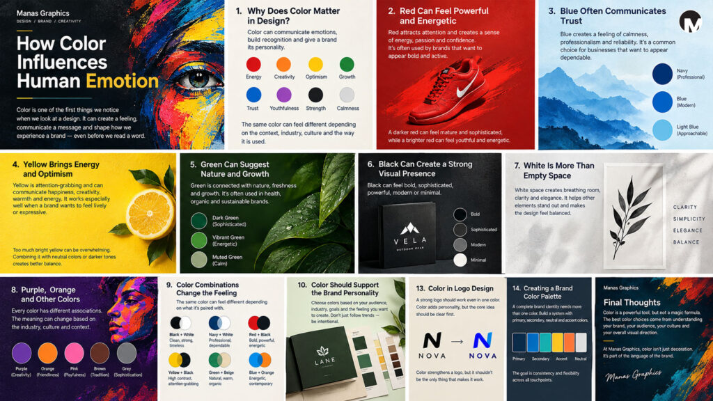
1. Why Does Color Matter in Design?
Imagine seeing the same logo in five different color combinations.
The shape remains exactly the same, the typography remains the same, and the layout does not change.
Yet each version can feel completely different.
That is the power of color.
Color can help communicate qualities such as:
- Energy
- Trust
- Creativity
- Luxury
- Youthfulness
- Strength
- Calmness
- Sophistication
This doesn’t mean that a particular color always creates exactly the same emotion.
Context matters.
The industry, culture, surrounding colors, typography, imagery, and even the way the color is used can change how people perceive it.
This is why choosing brand colors requires more thought than simply picking a favorite color.
2. Red Can Feel Powerful and Energetic
Red is a strong color.
It can immediately attract attention and create a sense of energy, urgency, passion, or confidence.
This is one reason red is often seen in brands that want to appear bold and active.
But red can also communicate completely different feelings depending on the context.
A dark red may feel mature or sophisticated, while a bright red may feel energetic and youthful.
The important question is not simply:
“Do I like red?”
The better question is:
“What should this brand communicate?”
If the answer involves energy, boldness, passion, or action, red might become an interesting part of the visual direction.
3. Blue Often Communicates Trust
Blue is one of the colors I often associate with stability and trust.
It can create a feeling of calmness, professionalism, reliability, and confidence.
This makes blue a common choice for businesses that want to appear dependable.
But again, not every blue communicates the same thing.
A deep navy blue can feel professional and established.
A bright blue can feel modern and energetic.
A softer blue can create a calmer and more approachable feeling.
Even a small change in color can influence the personality of a brand.
4. Yellow Brings Energy and Optimism
Yellow is naturally attention-grabbing.
It can communicate happiness, optimism, creativity, warmth, and energy.
Because of its brightness, yellow can work especially well when a brand wants to appear lively or expressive.
But bright colors also need balance.
Using too much intense yellow can make a design visually overwhelming. Combining it with neutral colors or darker tones can create stronger contrast and make the important elements easier to see.
For me, this is one of the interesting parts of color selection.
It isn’t only about the color itself.
It is also about the relationship between colors.
5. Green Can Suggest Nature and Growth
Green is strongly connected with nature, plants, freshness, and growth.
Because of these associations, it is often used by businesses related to environmental products, health, agriculture, organic products, and sustainability.
But green doesn’t have to be limited to those industries.
A dark green can feel sophisticated and established.
A vibrant green can feel energetic and youthful.
A muted green can feel natural and calm.
The same basic color family can therefore create very different visual personalities.
6. Black Can Create a Strong Visual Presence
Black is one of my favorite colors to consider in design because it can create such a strong presence.
It can feel bold, sophisticated, powerful, modern, or minimal.
A black logo can also work beautifully with different backgrounds and color systems.
But black is not automatically “premium.”
Its effect depends on typography, composition, spacing, imagery, materials, and the rest of the visual identity.
A sophisticated black-and-white identity can feel completely different from a dark, experimental, grunge-inspired identity.
The color is only one part of the story.
7. White Is More Than Empty Space
White is sometimes treated as if it is not really a design element.
I see it differently.
White space can create breathing room, clarity, simplicity, and elegance.
It allows other elements to stand out.
This is especially important when working with logos and brand identities.
As I discussed in my previous post about simplicity, removing unnecessary elements can make a design clearer. White space supports that idea by giving important elements room to exist.
Sometimes what you don’t put into a design is just as important as what you do.
8. Purple, Orange and Other Colors
Not every brand needs to rely on the traditional red, blue, or green associations.
Purple can suggest creativity, imagination, individuality, or luxury.
Orange can feel energetic, friendly, warm, and approachable.
Pink can communicate softness, playfulness, creativity, or bold contemporary expression depending on the shade and context.
Brown can feel earthy, traditional, natural, or warm.
Grey can feel neutral, sophisticated, industrial, or restrained.
These are only general associations.
There is no universal emotional formula where:
Blue = trust
or
Red = passion
and that’s the end of the story.
Design is more interesting than that.
9. Color Combinations Change the Feeling
A brand rarely uses just one color.
The relationship between colors can completely change the mood of a design.
Consider a few different combinations:
Black + White
Clean, strong, minimal, timeless.
Navy + White
Professional, calm, dependable.
Red + Black
Bold, powerful, energetic.
Yellow + Black
High contrast, energetic, attention-grabbing.
Green + Beige
Natural, warm, organic.
Blue + Orange
Energetic, contemporary, contrasting.
The same color can also feel different depending on the colors surrounding it.
This is why I prefer to test color combinations within an actual design rather than choosing colors in isolation.
10. Color Should Support the Brand Personality
When I start thinking about color for a brand, I don’t want to begin with:
“Which color is trending right now?”
I prefer to ask questions about the business.
Who is the audience?
What does the business offer?
What personality should it communicate?
What makes the business different?
What kind of emotional response should the visual identity create?
A children’s brand and a financial company may need completely different visual personalities.
A rock music brand may need something raw, expressive, and energetic.
A luxury brand may require restraint and sophistication.
A technology startup might want to feel innovative and contemporary.
The color should support that larger idea.
11. Don’t Choose Colors Just Because They Are Popular
Design trends can be useful sources of inspiration, but they can also become a trap.
If every brand uses the same color combinations because they are currently fashionable, those colors can eventually stop feeling distinctive.
I believe a brand should have a reason behind its visual choices.
This doesn’t mean avoiding trends completely.
It means understanding why a particular visual direction works for the brand before adopting it.
A good designer should be able to explain the decision.
Not necessarily with a complicated theory, but with a clear reason.
12. Color and Cultural Meaning
Color can also have different meanings in different cultures.
This is especially important when designing for businesses that operate across different regions or countries.
A color that represents celebration or good fortune in one culture may have a different association somewhere else.
That means color psychology should never be treated as an absolute rule.
Research matters.
Understanding the audience matters.
Context matters.
As designers, we should be careful about saying:
“This color always means this.”
It usually isn’t that simple.
13. Color in Logo Design
When designing a logo, I like to make sure the concept works before depending too heavily on color.
A strong logo should ideally have a recognizable form even when it is presented in one color.
This is particularly important because logos may eventually appear in:
- Black and white documents
- Photocopies
- Embossing
- Engraving
- Merchandise
- Packaging
- Small digital applications
Color can strengthen a logo, but it shouldn’t have to rescue a weak concept.
This connects directly to my previous article about simplicity.
A clear shape, strong typography, and meaningful concept should provide the foundation.
Color then becomes another layer of communication.
14. Creating a Brand Color Palette
A complete brand identity usually needs more than one color.
There may be:
- Primary brand colors
- Secondary colors
- Neutral colors
- Background colors
- Accent colors
The goal is not to collect as many colors as possible.
The goal is to create a system.
For example, one strong primary color can become the recognizable foundation, while supporting colors provide flexibility across websites, packaging, social media, presentations, and printed materials.
A good palette should give a brand enough freedom to communicate without losing consistency.
15. How I Approach Color at Manas Graphics
When developing a visual identity, I like to explore color after understanding the concept and personality of the brand.
I may start with references, mood boards, visual research, or simple color experiments.
Then I test different combinations.
Sometimes the first color choice feels right.
Sometimes it completely changes after seeing it next to the typography and visual elements.
This is where design becomes an exploration.
A color that looks beautiful on a color palette can behave differently when applied to a logo, website, packaging, or social media design.
So I believe in testing rather than assuming.
Final Thoughts
Color is one of the most powerful tools in visual communication.
But it is not a magic formula.
A color does not automatically create a particular emotion, and there is no single palette that works for every brand.
Good color choices come from understanding the business, the audience, the personality, the culture, and the overall visual direction.
For me, the best color decisions are the ones that feel intentional.
They support the idea.
They create a mood.
They help people recognize the brand.
And most importantly, they work as part of a larger visual identity.
At Manas Graphics, I don’t see color as decoration added at the end of a design.
I see it as part of the language of the brand.
Because sometimes, before a brand even says a word, its colors have already started talking.
More from Manas Graphics
In my next post, I’ll continue exploring one of the most important elements of visual identity: typography — and why typography is much more than simply choosing a font.