
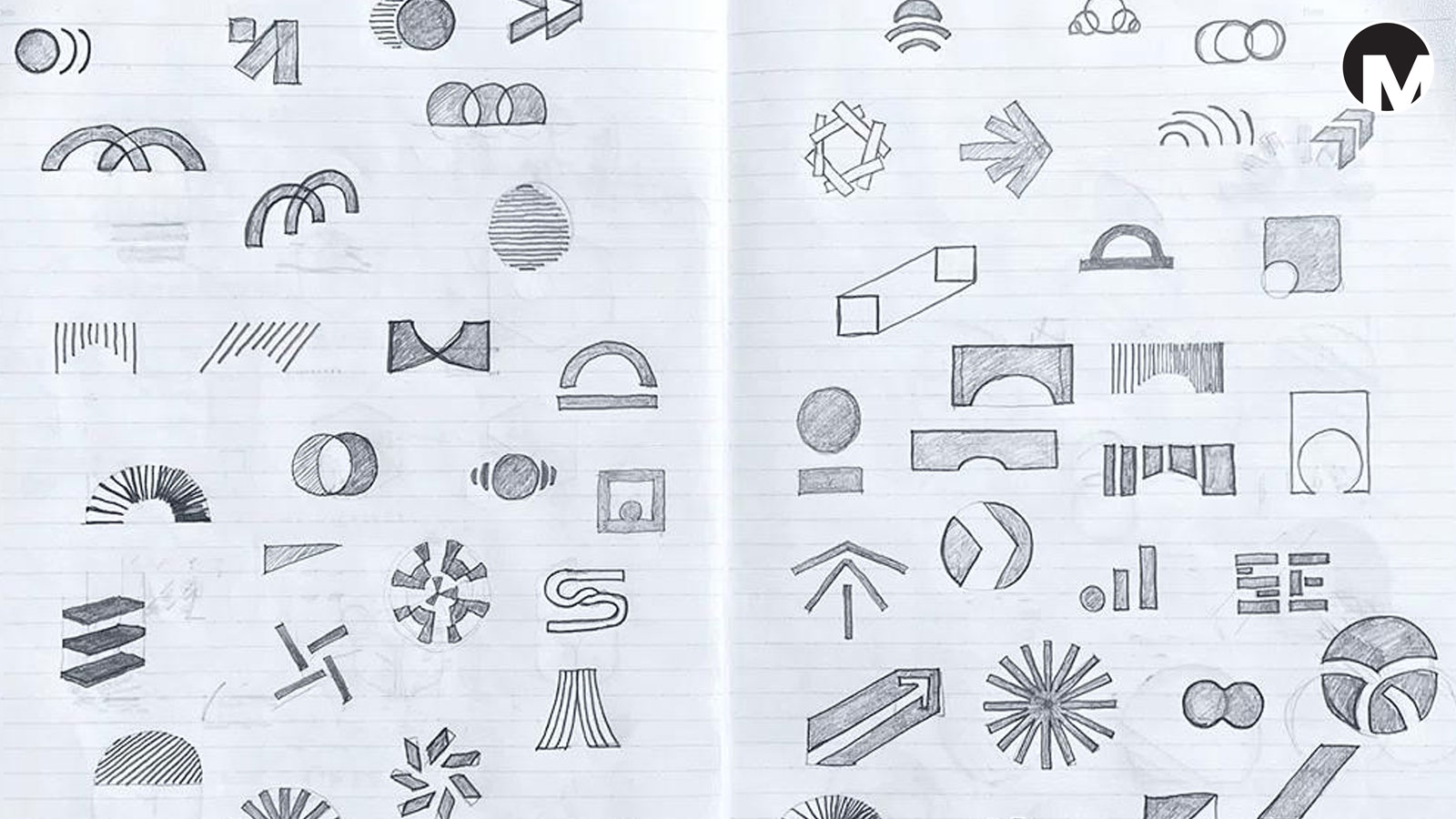
A great logo doesn’t always need to be complicated.
Sometimes, the most memorable logos are the ones that look simple. A clean shape, a well-chosen typeface, or a small visual idea can communicate more effectively than a design filled with unnecessary details.
But simplicity is not as easy as it looks.
As a graphic designer, I have learned that creating something simple often requires more thought, research, and refinement than creating something complex. The challenge is to remove what is unnecessary while keeping what makes the design meaningful.
At Manas Graphics, I see simplicity as one of the most useful principles in logo design. It helps a logo become recognizable, flexible, and easier to remember.
1. What Does Simplicity Mean in Logo Design?
Simplicity in logo design means creating a visual identity with only the elements needed to communicate the right idea.
It doesn’t mean every logo must be a plain black wordmark or a basic geometric shape. A simple logo can still be expressive, bold, sophisticated, or full of personality.
Think about a logo that you can recognize quickly, even when it is small or printed in one color. That is one of the advantages of a simple design.
A simple logo usually has:
- A clear visual idea.
- An intentional shape or wordmark.
- A limited number of visual elements.
- Typography that is easy to read.
- A design that works without unnecessary decoration.
The goal is not to make a logo look empty. The goal is to make it communicate clearly.
2. Why Complicated Logos Can Become Difficult to Use
Imagine a business with a logo containing several illustrations, multiple typefaces, gradients, detailed textures, and many small elements.
It may look interesting when presented on a large screen. But what happens when the same logo is printed on a business card, used as a social media profile picture, or placed on packaging?
Some details may disappear. The text may become difficult to read. The logo may lose its visual impact.
This is why a logo needs to work in different situations.
A business might use its logo on:
- Websites and social media.
- Business cards and stationery.
- Product packaging.
- Signboards and advertisements.
- Small digital icons.
A simpler design can make these applications easier to manage while keeping the identity recognizable.
Of course, a detailed logo is not automatically a bad logo. The real question is whether the design serves its purpose.
3. Simplicity Makes Logos Easier to Recognize
Recognition is one of the most important functions of a logo.
When people see a logo repeatedly, they begin to associate its visual features with a particular business. A clear shape, distinctive letterform, or memorable combination of elements can help build that association.
Think of a few familiar logos:
<em>Apple, Nike, and McDonald’s.</em>
Their visual identities are recognizable because of distinctive ideas and consistent use over time. They do not need to explain everything about their businesses through the logo itself.
A logo doesn’t have to show every product or service a company offers. It needs to create a memorable visual starting point.
This is especially useful for small businesses that want to build recognition gradually.
4. Simplicity Does Not Mean Boring
One of the biggest misunderstandings about simple design is that it must look plain or generic.
I don’t believe that is true.
A simple logo can be:
- Bold and confident.
- Dynamic and energetic.
- Sophisticated and refined.
- Playful and expressive.
- Raw and experimental.
The personality comes from the design decisions.
For example, a bold geometric wordmark can feel powerful. A carefully drawn organic symbol can feel warm and human. A distinctive letterform can make a simple logo feel unique.
The number of elements is not what determines creativity. It is how those elements are chosen and arranged.
5. The Importance of Negative Space
Negative space is the empty area around and within the elements of a design.
It is one of my favorite parts of graphic design because empty space can become an active part of the visual idea.
A logo can use negative space to create a hidden shape, separate elements, or give a symbol a sense of balance.
The FedEx logo is a well-known example of a wordmark that uses negative space to create an arrow between its letters.
What I find interesting about this approach is that the empty space is not really empty. It becomes part of the communication.
But negative space should not be added just to make a logo look clever. It should support the idea and remain understandable.
6. Typography Can Make a Simple Logo Powerful
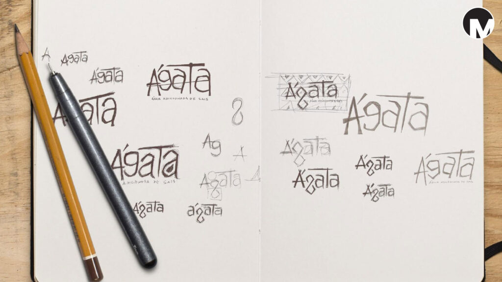
Typography is especially important when designing a wordmark.
A logo made only from text can still have a strong personality. The choice of typeface, spacing, proportions, and letterforms can change the entire feeling of a design.
A modern sans-serif typeface may create a clean and confident impression. A serif typeface may feel more traditional or editorial. A custom letterform can give the logo a distinctive character.
Even small adjustments can make a difference:
- Letter spacing.
- Weight and proportions.
- Alignment.
- Custom modifications.
- The relationship between letters.
When designing a wordmark, I like to think beyond simply choosing a font. The typography itself should become part of the visual identity.
7. Fewer Colors Can Create a Stronger Identity
Color is another area where simplicity can help.
A logo does not need a large collection of colors to be effective. Sometimes, one distinctive color combined with a neutral palette is enough to create a strong visual impression.
A limited color palette can make a brand easier to recognize and help maintain consistency across different applications.
However, I don’t think every logo needs to be black and white. Color should be chosen according to the brand’s personality, audience, and purpose.
A bold red, a deep blue, a vibrant yellow, or a combination of contrasting colors can all work beautifully when they have a clear reason behind them.
The important thing is to avoid using color as a substitute for a strong design idea.
8. Simple Logos Are Easier to Adapt
One of the practical benefits of simplicity is flexibility.
A logo may need to work in different sizes, formats, and materials. A design that is clear and well-constructed can often adapt more easily.
For example, a logo might appear on a large signboard, a website header, a printed invoice, and a small social media icon.
The design should remain recognizable across these different applications.
This is where a well-designed logo system becomes useful. A business may need variations such as a primary logo, a simplified mark, or a one-color version.
Simplicity gives the designer a strong foundation for creating these variations without losing the main identity.
9. The Difference Between Simple and Generic
There is a difference between simplicity and a lack of originality.
A generic logo may use familiar shapes, common typefaces, or visual ideas that do not create a distinctive identity. It may look clean, but it doesn’t necessarily help the business stand apart.
A simple logo, on the other hand, can have a clear concept and a unique visual character.
For me, the important question is:
What makes this logo belong to this particular business?
The answer might be a unique letterform, an interesting proportion, a meaningful symbol, or an unexpected combination of visual elements.
Simplicity should remove unnecessary details, not remove the personality of the brand.
10. How I Approach Simplicity at Manas Graphics
When I work on a logo concept, I like to begin with the business rather than jumping straight into decoration.
I think about what the business represents, who it is trying to reach, and what kind of personality it should communicate.
From there, I explore ideas through research and sketching.
I may begin with a rough drawing, a letterform, an abstract shape, or a visual concept. Then I refine the idea, test different proportions, and consider how it might work across different applications.
The goal is to arrive at a design that feels intentional.
I don’t want to create something that is simple just because minimalism is popular. I want to create something that has a reason behind every important design decision.
For me, simplicity is about clarity, originality, and purpose.
11. A Simple Logo Still Needs a Strong Brand Identity
A logo is only one part of a brand identity.
As I discussed in my previous post, a complete brand identity includes typography, colors, imagery, layouts, graphic elements, and other visual and verbal choices.
A simple logo can become much more powerful when it is supported by a consistent identity system.
Imagine a business with a clean wordmark, a distinctive color palette, carefully chosen typography, and a consistent layout style.
The logo identifies the business. The identity system helps express its personality across different touchpoints.
This is why simplicity in logo design should not be confused with simplicity in every part of branding. A brand can have a simple logo and still use expressive photography, illustration, packaging, or graphic design.
The logo is the foundation. The identity brings the larger visual language to life.
12. What Makes a Simple Logo Successful?
For me, a successful simple logo should meet a few important criteria.
Recognition: Can people identify it easily?
Clarity: Does the design communicate a clear visual idea?
Originality: Does it have something distinctive that belongs to the brand?
Functionality: Does it work at different sizes and in different applications?
Timelessness: Can it remain useful without depending too heavily on a temporary design trend?
Personality: Does it express the right feeling for the business?
A logo does not have to be perfect in every possible way. But it should be designed with purpose.
Final Thoughts
Simplicity is not about doing less work.
It is about making better decisions.
A simple logo can look effortless, but behind that result there may be hours of research, sketching, typography exploration, and refinement.
As a designer, I enjoy that process. I like taking a broad idea and finding a visual expression that feels clear, distinctive, and meaningful.
At Manas Graphics, I believe a great logo should be more than a decoration. It should be a strong visual foundation for a brand.
Because sometimes, the simplest idea is the one people remember.
More from Manas Graphics
In my next posts, I will continue exploring the relationship between design, creativity, and visual identity. If you enjoyed this article, you can also read my earlier post, The Difference Between a Logo, Brand and Brand Identity, to understand how a logo fits into the bigger picture of branding.